- JUNE 2025 TO AUGUST 2025 -
DATADOG-INTERNSHIP
DATADOG IS A LEADING CLOUD-BASED MONITORING AND SECURITY PLATFORM FOR MODERN APPLICATIONS.
After completing my third year at NYU, I interned with Datadog’s Application Performance Monitoring (APM) team, where I helped resolve customer pain points by optimizing the APM service pages. APM customers receive out-of-the-box “dashboards” called service pages for their services, which are the building blocks of microservice architecture, grouping endpoints and queries to build customer applications. The service page provides users with information about service health, monitoring states, Watchdog insights, summary cards, and more. During my internship, I worked with engineers and product managers to ship high-fidelity screens and a prototype of customizable service pages.
TOOLS USED
Ballpark HQ
User Interviews
Figma
Ballpark HQ
User Interviews
Figma
CATEGORY
Product Design Case Study
Product Design Case Study
DELIVERABLES
UX Research
UX Design
Figma Website Prototype
UX Research
UX Design
Figma Website Prototype
⎯⎯⎯⎯⎯⎯⎯⎯⎯⎯⎯⎯⎯⎯⎯⎯⎯⎯⎯⎯⎯⎯⎯
THE PROBLEM
SERVICE PAGES FOLLOW A STATIC, ONE-SIZE-FITS-ALL APPROACH FOR ALL DATADOG CUSTOMERS...
Service pages assume users are instrumented across all Datadog signals (e.g., Infrastructure, Logs, Security, etc.), which works for advanced users, but often overwhelms smaller teams or APM-first customers. As a result, users get confused by the visual overload of non-relevant service page sections and instead heavily rely on custom dashboards, often containing duplicate service page data, for their workflows.
BELOW IS A QUICK SCREEN RECORDING OVERVIEW OF CURRENT APM SERVICE PAGES:
APM SERVICE PAGE EXAMPLE
⎯⎯⎯⎯⎯⎯⎯⎯⎯⎯⎯⎯⎯⎯⎯⎯⎯⎯⎯⎯⎯⎯⎯
RESEARCH
IN A DISCOVERY STUDY WITH 64 EXTERNAL USERS AND 7 INTERNAL ENGINEERS, THE FOLLOWING DATA WERE COLLECTED:
• 86.2% of survey respondents presented a strong interest in customizable service pages.
• Survey respondents were asked to rank 6 customization features by preference, and the top 3 were:
** Note: Lower ranks indicate higher overall preference (1 = most useful, 6 = least useful). **
a. Ability to hide irrelevant sections (average rank 2.8).
b. Ability to reorder sections (average rank 3.1).
c. Ability to embed custom metrics (average rank 3.1).
• 26 survey respondents reported needing additional custom metrics on APM service pages.
a. 13 created dashboards to supplement missing data.
b. 11 turned to external tools due to a lack of flexibility.
• Internal engineers noted they focus on only ~60% of service page sections, based on the ones relevant for their workflows.
• 49.2% of users emphasized the need for shared layouts to improve collaboration during incident response or rollout tracking.
⎯⎯⎯⎯⎯⎯⎯⎯⎯⎯⎯⎯⎯⎯⎯⎯⎯⎯⎯⎯⎯⎯⎯
USER PERSONA

CONNOR PETERSON - APM-FIRST BACKEND SOFTWARE ENGINEER
PAIN POINTS:
• Service pages surface too much irrelevant information, leading to noise and cognitive overload.
• Rigid layout makes service pages difficult to tailor to use cases (e.g., incident response, debugging).
• Heavy reliance on dashboards or external tools to access key metrics and streamline workflows.
NEEDS:
• Flexibility to create service page layouts aligned with workflows (e.g., incident response vs. debugging).
• Ability to reorder or hide service page sections based on priority, and embed custom metrics.
• Shared service page layouts with team-wide consistency for easy collaboration and on-call rotations.
⎯⎯⎯⎯⎯⎯⎯⎯⎯⎯⎯⎯⎯⎯⎯⎯⎯⎯⎯⎯⎯⎯⎯
SOLUTION IDEATION
THROUGH QUANTITATIVE AND QUALITATIVE DATA COLLECTION FROM EXTERNAL APM CUSTOMERS ALONGSIDE DATADOG ENGINEERS, I BRAINSTORMED SOLUTIONS SERVICE PAGES NEEDED TO IMPLEMENT TO IMPROVE A USER’S APM EXPERIENCE:
1. OBVIOUS, INTUITIVE EDIT STATE INTERFACE
The service page edit state needs to be distinguishable from the page view mode, and edit functionality should be easily discoverable.
2. ABILITY TO REORDER SECTIONS
When configuring a service page, users should have access to reordering sections, allowing them to move sections higher based on priority.
3. CUSTOM METRICS INTEGRATION
Users must have access to add custom metrics and widgets to service pages to prevent reliance on external tools or setting up dashboards.
4. FAMILIAR UX PATTERNS FROM DATADOG DASHBOARDS
To replicate the mental model built through dashboard interactions, the 'adding custom metrics' flow should utilize dashboard components.
5. CLEAR INDICATION OF SAVED LAYOUT
After saving edits made to a service page’s layout, it should be clear to the user that their changes have been successfully saved.
⎯⎯⎯⎯⎯⎯⎯⎯⎯⎯⎯⎯⎯⎯⎯⎯⎯⎯⎯⎯⎯⎯⎯
USER TESTING
9 FULL-TIME DATADOG ENGINEERS WERE OBSERVED USING THE INITIAL SERVICE PAGE PROTOTYPE AND THEN GUIDED THROUGH A STRUCTURED INTERVIEW SESSION:
• Engineers described adding custom widgets and metrics as "intuitive" and "satisfying," aligning with existing dashboard patterns.
• 100% of testers found reordering sections to be easily discoverable and provided immediate value to their workflows.
• 100% of testers appreciated sections automatically collapsing and re-expanding to their previous state upon saving service page edits.
KEY TAKEAWAYS TO COMMUNICATE WITH PRODUCT MANAGER AND ENGINEERS FOR Q4 IMPLEMENTATION:
• Clarify the distinction of personal vs. team-level service page layouts to avoid workflow fragmentation and easy collaboration.
• Add clear indicators when new sections are introduced to service pages so users can easily discover them despite their customized view.
• Explore an “Import from Dashboard” feature for custom sections to streamline migration away from dashboards and reduce manual work.
⎯⎯⎯⎯⎯⎯⎯⎯⎯⎯⎯⎯⎯⎯⎯⎯⎯⎯⎯⎯⎯⎯⎯
FINAL SCREENS
BELOW ARE THE FINAL SCREEN MOCKUPS FROM THE MOST IMPORTANT PAGES IN THE FINALIZED PROTOTYPE:
⎯⎯⎯⎯⎯⎯⎯⎯⎯⎯⎯⎯⎯⎯⎯⎯⎯⎯⎯⎯⎯⎯⎯
FINAL SOLUTIONS
AFTER FINALIZING THE INTERFACE SCREENS, I BEGAN PROTOTYPING THE FUNCTIONS OF THE SERVICE PAGE TO CREATE ONE OVERALL, COHESIVE EXPERIENCE THAT ENTIRELY COVERS WHAT CONFIGURABLE SERVICE PAGES PROVIDE USERS. THE FINALIZED PROTOTYPE CONSISTS OF FOUR CORE SOLUTIONS, ALL RELATING TO EACH OTHER IN SOME WAY WITHIN THE SERVICE PAGE:
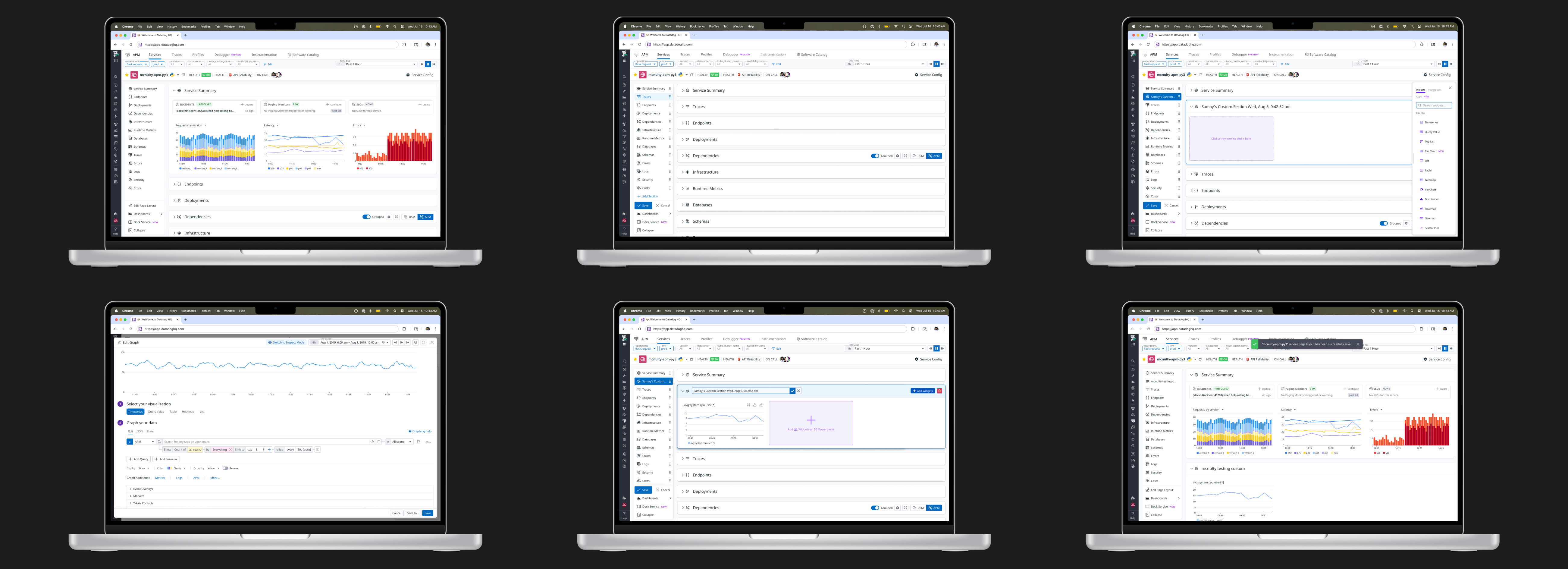
1. CLEAR INDICATION OF ENTERING SERVICE PAGE EDIT STATE
The “Edit Page Layout” button is easily accessible in the left panel. Users often have multiple sections expanded when using service pages, so entering edit mode displays a drop-shadow for sections and automatically collapses them for clarity. An “Add Section” button for custom metrics and drag icons for reordering are also displayed.
The “Edit Page Layout” button is easily accessible in the left panel. Users often have multiple sections expanded when using service pages, so entering edit mode displays a drop-shadow for sections and automatically collapses them for clarity. An “Add Section” button for custom metrics and drag icons for reordering are also displayed.
2. SECTION REORDERING FUNCTIONALITY
Through the left-side panel, users can reorder sections of the service page, moving those they prioritize higher and pushing the ones irrelevant to their workflows towards the bottom of the page. The drag-and-drop interaction within the panel is synced in real-time on the right area with the main, collapsible sections.
Through the left-side panel, users can reorder sections of the service page, moving those they prioritize higher and pushing the ones irrelevant to their workflows towards the bottom of the page. The drag-and-drop interaction within the panel is synced in real-time on the right area with the main, collapsible sections.
3. EMBEDDING CUSTOM METRICS AND WIDGETS
Users can use the “Add Section” button in the side panel to create a custom section and add widgets with telemetry they value. They can rename their custom section through a delayed on-hover interaction over the default name. The CTA button, widget side panel, and rename section button are the same components utilized in Datadog Dashboards.
4. SAVED LAYOUT VERIFICATION
After a user configures a service page to tailor it to their needs and workflows, a toast message is displayed informing them of their saved changes. Sections no longer display a drop shadow, and all sections that collapsed when the user entered the service page edit state expand again.
After a user configures a service page to tailor it to their needs and workflows, a toast message is displayed informing them of their saved changes. Sections no longer display a drop shadow, and all sections that collapsed when the user entered the service page edit state expand again.
⎯⎯⎯⎯⎯⎯⎯⎯⎯⎯⎯⎯⎯⎯⎯⎯⎯⎯⎯⎯⎯⎯⎯
WORKING PROTOTYPE
TOUCH ANYWHERE ON THE SCREEN TO SEE HINTS THAT DIRECT YOU TO WHERE TO CLICK TO PROCEED WITH THE FIGMA WEB PROTOTYPE FEATURES. USE ON DESKTOP FOR OPTIMAL EXPERIENCE.
The prototype showcases entering a service page’s edit mode, being able to reorder sections, and adding custom metrics. Scroll through the page while interacting with prototyped functionality to get the closest real-world experience of configurable service pages.
⎯⎯⎯⎯⎯⎯⎯⎯⎯⎯⎯⎯⎯⎯⎯⎯⎯⎯⎯⎯⎯⎯⎯
OPEN QUESTIONS
GIVEN THE LIMITED ENGINEERING BANDWIDTH IN Q3 AND THE SHORT TIMEFRAME OF MY INTERNSHIP, I DOCUMENTED OPEN QUESTIONS FOR MY PRODUCT MANAGER, ENGINEERS, AND THE DESIGNER INHERITING THIS PROJECT TO CONSIDER NEXT QUARTER, AS THEY WERE CURRENTLY OUT OF SCOPE DURING MY INTERNSHIP.
TOPICS
⎯⎯⎯⎯⎯⎯⎯⎯⎯⎯⎯⎯⎯
a. Ability to turn service page sections off.
b. Team / shared view editing permission.
c. No “Undo” or “Reset to Default View” in prototype.
d. Threshold for the maximum number of created customs sections.
e. Maximum height for custom sections with widgets.
f. New service page feature visibility.
g. Importing existing widgets from dashboards.
RATIONALE
⎯⎯⎯⎯⎯⎯⎯⎯⎯⎯⎯⎯⎯
a. Moving sections down the page replicates disabling them.
b. Additional research is required before Q4 implementation.
c. Allow users to access version history similar to dashboards.
d. Avoid overloading the services pages with countless sections.
e. Avoid taking up excessive space when sections are expanded.
f. Low feature placement can lead to hidden visibility for users.
g. Reduce friction in manual import of data into service pages.
⎯⎯⎯⎯⎯⎯⎯⎯⎯⎯⎯⎯⎯⎯⎯⎯⎯⎯⎯⎯⎯⎯⎯
CLOSING
CONDUCTING IN-DEPTH RESEARCH TO UNDERSTAND USER PAIN POINTS ALLOWED ME TO PUSH FOR MY DATA-BACKED DESIGN DECISIONS TO MY PRODUCT MANAGER, ENGINEERS, AND DESIGN TEAM.
Despite the final design solution meeting the requirements of this initiative’s scope, a critical aspect I could have improved is how in-depth the usability testing was. While internal testing was valuable, had I spent longer on this project, I would have talked to external APM users to understand if the solution fit their needs and tackled the frustrations they experience with service pages. Working more closely with my UX researcher, not just for discovery research, but for validating solutions, is my biggest takeaway to work on after the internship.
Collectively, I gained real-world experience on the 0-to-1 product design process throughout my internship. I had the opportunity to work on a mini-project at the start of my internship, helping me ramp up to understanding APM to work on this initiative for a page used by a large number of Datadog customers. Research synthesis, solution ideation, prototyping, and packaging finalized designs for engineers was a collaborative experience that helped me learn how to manage stakeholder expectations. I’m extremely grateful for this opportunity to work for the Datadog APM team and thank my manager, Kyu Hwang, and mentor, Trang Nguyen, for their guidance throughout this journey.