
- MAY 2024 TO AUGUST 2024 -
HOME DEPOT INTERNSHIP
THE HOME DEPOT, A FORTUNE 20 COMPANY, IS THE LARGEST HOME IMPROVEMENT RETAILER IN THE UNITED STATES.
Following my second year at NYU, I interned for The Home Depot within their supply chain UX team, building solutions for their distribution centers. Through close collaboration with designers, software engineers, and product managers, I reimagined how upper management can access supply chain data metrics to make informed decisions with the MySupplyChainHealth application. By the end of my internship, I shipped high-fidelity screens alongside a working prototype to the engineering team to develop.
TOOLS USED
Jira
Miro
Figma
Jira
Miro
Figma
CATEGORY
Product Design Case Study
Product Design Case Study
DELIVERABLES
UX Research
UX Design
Figma Website Prototype
UX Research
UX Design
Figma Website Prototype
⎯⎯⎯⎯⎯⎯⎯⎯⎯⎯⎯⎯⎯⎯⎯⎯⎯⎯⎯⎯⎯⎯⎯
THE PROBLEM
THERE ARE TOO MANY TOOLS AND ALERTS FOR UPPER LEADERSHIP TO ACCESS SUPPLY CHAIN METRICS...
Within the supply chain space at Home Depot, managers, executives, and developers have an overload of tools to monitor the health of the supply chain process, leading to a lack of efficiency when tracking data and overall management issues. With it being impossible to go through all resources to check data consistently, leadership reviews metrics only when there is an urgent problem.
⎯⎯⎯⎯⎯⎯⎯⎯⎯⎯⎯⎯⎯⎯⎯⎯⎯⎯⎯⎯⎯⎯⎯
RESEARCH
IN A PRELIMINARY QUESTIONNAIRE OF 10 FULL-TIME HOME DEPOT EMPLOYEES, THE FOLLOWING DATA WERE COLLECTED:
• The effectiveness of supply chain reports and resources dynamically displaying data received an average rating of 4.06/10.
• The efficiency of locating data within supply chain reports and resources received an average rating of 5.41/10.
• 17.65% of Home Depot employees reference supply chain metrics more than thrice weekly.
• 88.24% experience management and organizational issues with health metrics due to overloaded reports.
• 100% want access to a central supply chain data resource with easily accessible information.
⎯⎯⎯⎯⎯⎯⎯⎯⎯⎯⎯⎯⎯⎯⎯⎯⎯⎯⎯⎯⎯⎯⎯
USER PERSONA

DAVID TAYLOR - VETERAN SUPPLY CHAIN, SOFTWARE ENGINEER MANAGER
PAIN POINTS:
• Supply chain data is very unorganized and spread out, as there’s no central channel.
• With too many tools, it’s impossible to check the supply chain health consistently.
• The supply chain health metric reports sent out are currently very static.
NEEDS:
• Having access to a singular health metrics tool covering numerous areas of the supply chain process.
• Flexibility to obtain or view the supply chain information in numerous dynamic ways.
• A map feature providing a general overview of supply chain health.
⎯⎯⎯⎯⎯⎯⎯⎯⎯⎯⎯⎯⎯⎯⎯⎯⎯⎯⎯⎯⎯⎯⎯
SOLUTION IDEATION
THROUGH QUANTITATIVE AND QUALITATIVE DATA COLLECTION FROM HOME DEPOT EMPLOYEES, I BRAINSTORMED SOLUTIONS THAT MYSUPPLYCHAINHEALTH NEEDED TO IMPLEMENT TO IMPROVE A USER’S EXPERIENCE FOR SUPPLY CHAIN DATA:
1. CENTRAL HUB FOR ALL THE SUPPLY CHAIN WAREHOUSES
For ease of access to supply chain data metrics, upper management should have access to information about all distribution centers.
2. DATA DISPLAYED PRACTICALLY AND VISUALLY
Users should be able to view all the supply chain data through a table alongside an overarching view of each distribution center’s health through a map page.
3. EASY TO QUICKLY COMPREHEND
The product should be simple to use and easily accessible, limiting the learning curve for understanding the data displayed.
4. VARIOUS OPTIONS FOR FILTERING
The product must include a robust filtering feature for users to make data-informed supply chain decisions.
5. ABILITY TO DOWNLOAD DATA
For users to quickly reference data, the product must be capable of having its displayed data downloadable.
⎯⎯⎯⎯⎯⎯⎯⎯⎯⎯⎯⎯⎯⎯⎯⎯⎯⎯⎯⎯⎯⎯⎯
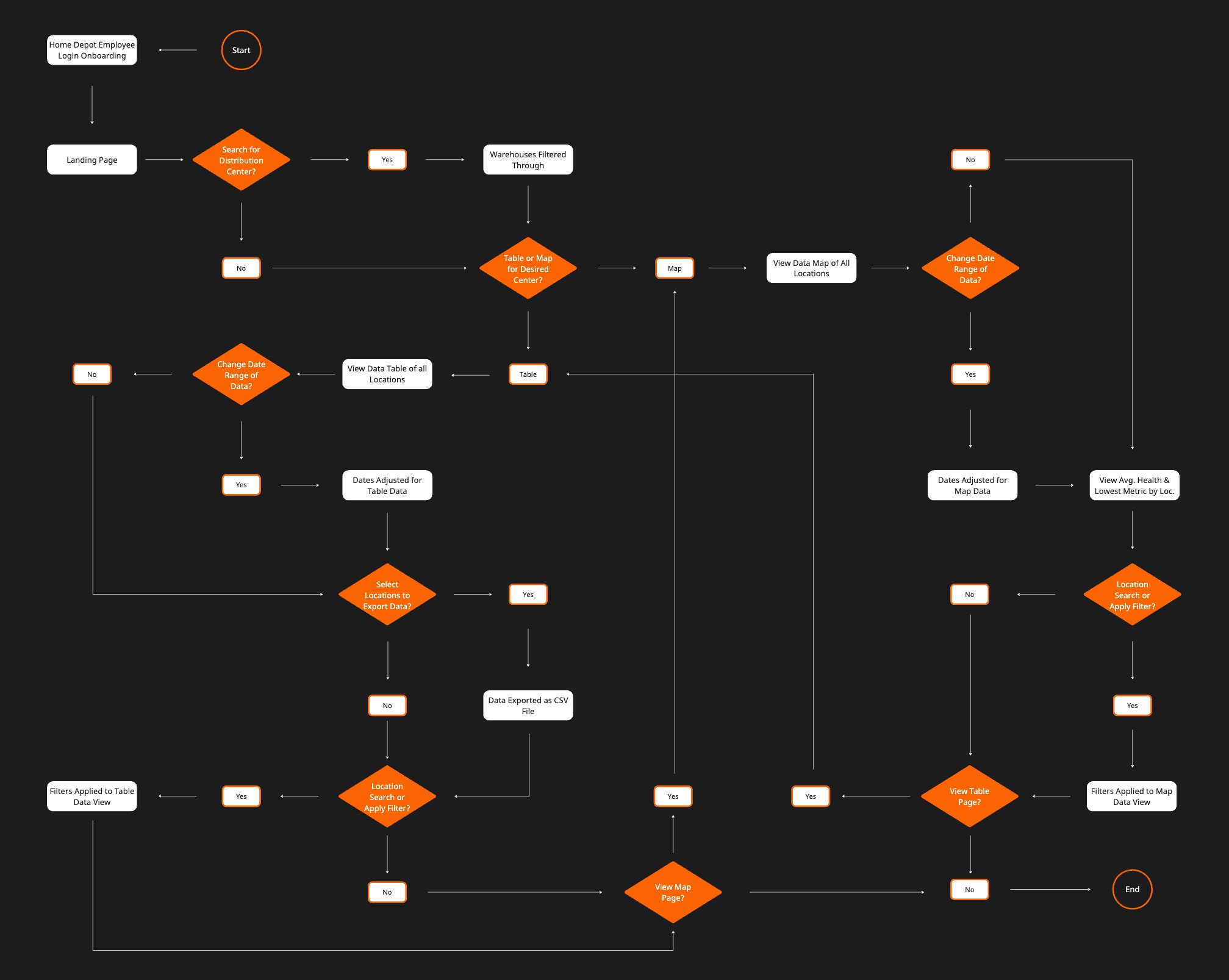
USER FLOW
USING MIRO, I CREATED A USER FLOW TO GUIDE ME ON THE PAGES AND INTERACTIONS TO FOCUS ON WHEN CREATING THE MYSUPPLYCHAINHEALTH APP PROTOTYPE IN FIGMA. THE FEATURES COVERED IN THE USER FLOW ARE ESSENTIAL FOR EMPLOYEES WHEN USING THE APPLICATION:
⎯⎯⎯⎯⎯⎯⎯⎯⎯⎯⎯⎯⎯⎯⎯⎯⎯⎯⎯⎯⎯⎯⎯
USER TESTING
12 FULL-TIME HOME DEPOT EMPLOYEES WERE OBSERVED USING THE INITIAL APPLICATION PROTOTYPE AND THEN INSTRUCTED THROUGH ANOTHER QUESTIONNAIRE:
• For efficiency in locating, comprehending, and accessing data, MySupplyChainHealth received an average rating of 8.42/10.
• 100% of testers preferred the MySupplyChainHealth application versus the current ecosystem of supply chain tools.
• 100% of testers claimed they would use the MySupplyChainHealth application in their day-to-day practices.
KEY TAKEAWAYS TO WORK ON FOR MY FINALIZED PROTOTYPE:
• Include a navigation bar on the table and map pages to switch between the features.
• Add tooltips within the product for users to quickly identify specific features and functionality.
• Improve visibility and Home Depot design system principles in call-to-action areas, specifically on the landing page.
⎯⎯⎯⎯⎯⎯⎯⎯⎯⎯⎯⎯⎯⎯⎯⎯⎯⎯⎯⎯⎯⎯⎯
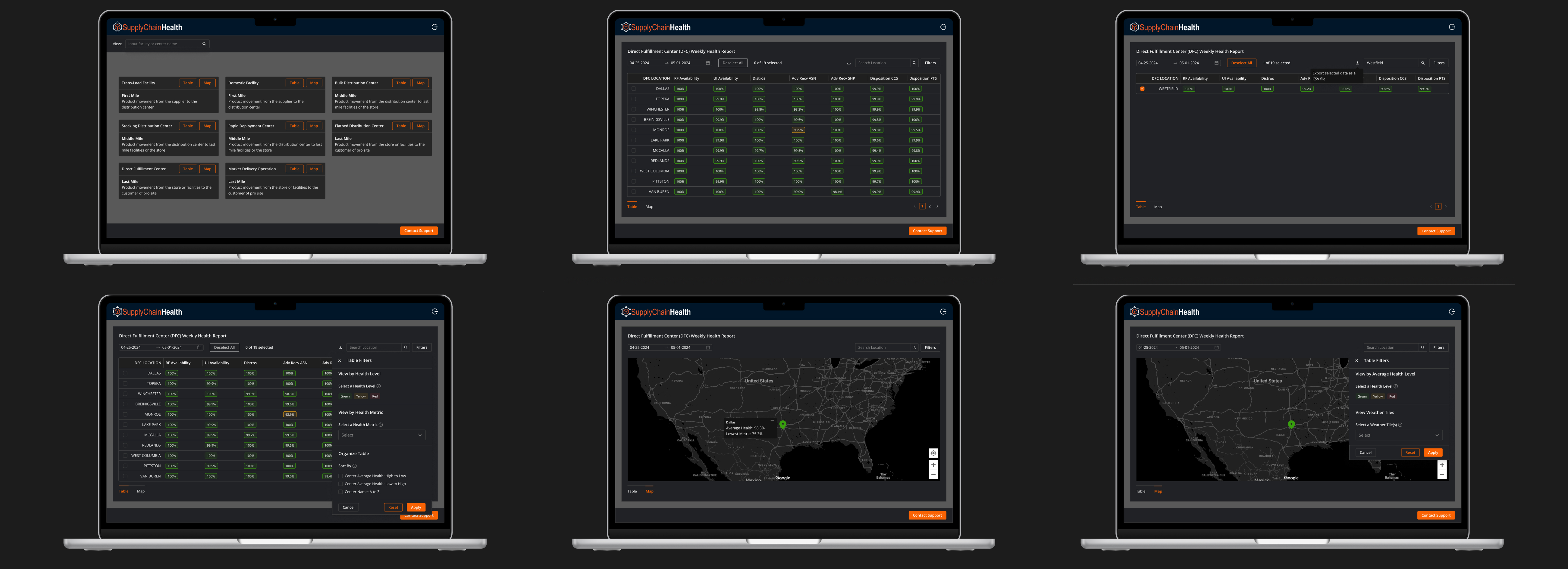
FINAL SCREENS
BELOW ARE THE FINAL SCREEN MOCKUPS FROM THE MOST IMPORTANT PAGES IN THE FINALIZED PROTOTYPE:
⎯⎯⎯⎯⎯⎯⎯⎯⎯⎯⎯⎯⎯⎯⎯⎯⎯⎯⎯⎯⎯⎯⎯
FINAL SOLUTIONS
AFTER FINALIZING THE INTERFACE SCREENS, I BEGAN PROTOTYPING THE FUNCTIONS OF THE WEB APPLICATION TO CREATE ONE OVERALL, COHESIVE EXPERIENCE THAT ENTIRELY COVERS WHAT MYSUPPLYCHAINHEALTH PROVIDES USERS. THE FINALIZED PROTOTYPE CONSISTS OF FIVE CORE SOLUTIONS, ALL RELATING TO EACH OTHER IN SOME WAY WITHIN THE APP’S FEATURES:
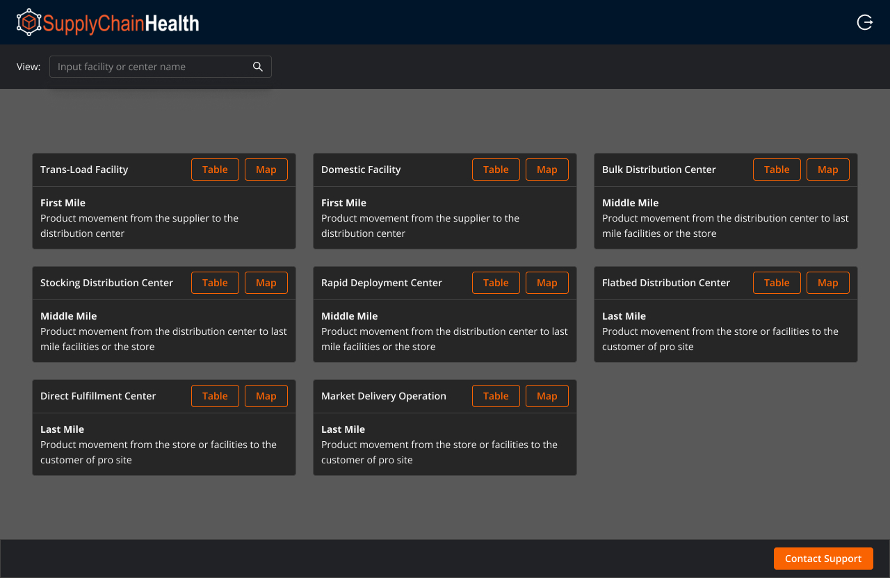
1. ACCESS TO ALL SUPPLY CHAIN FACILITIES
After logging into the product, users can view supply chain health metrics from all eight Home Depot warehouses. The landing page eliminates having to go back and forth between different tools or resources, and instead, users have an overview of the entire supply chain process through just a single tool.
After logging into the product, users can view supply chain health metrics from all eight Home Depot warehouses. The landing page eliminates having to go back and forth between different tools or resources, and instead, users have an overview of the entire supply chain process through just a single tool.
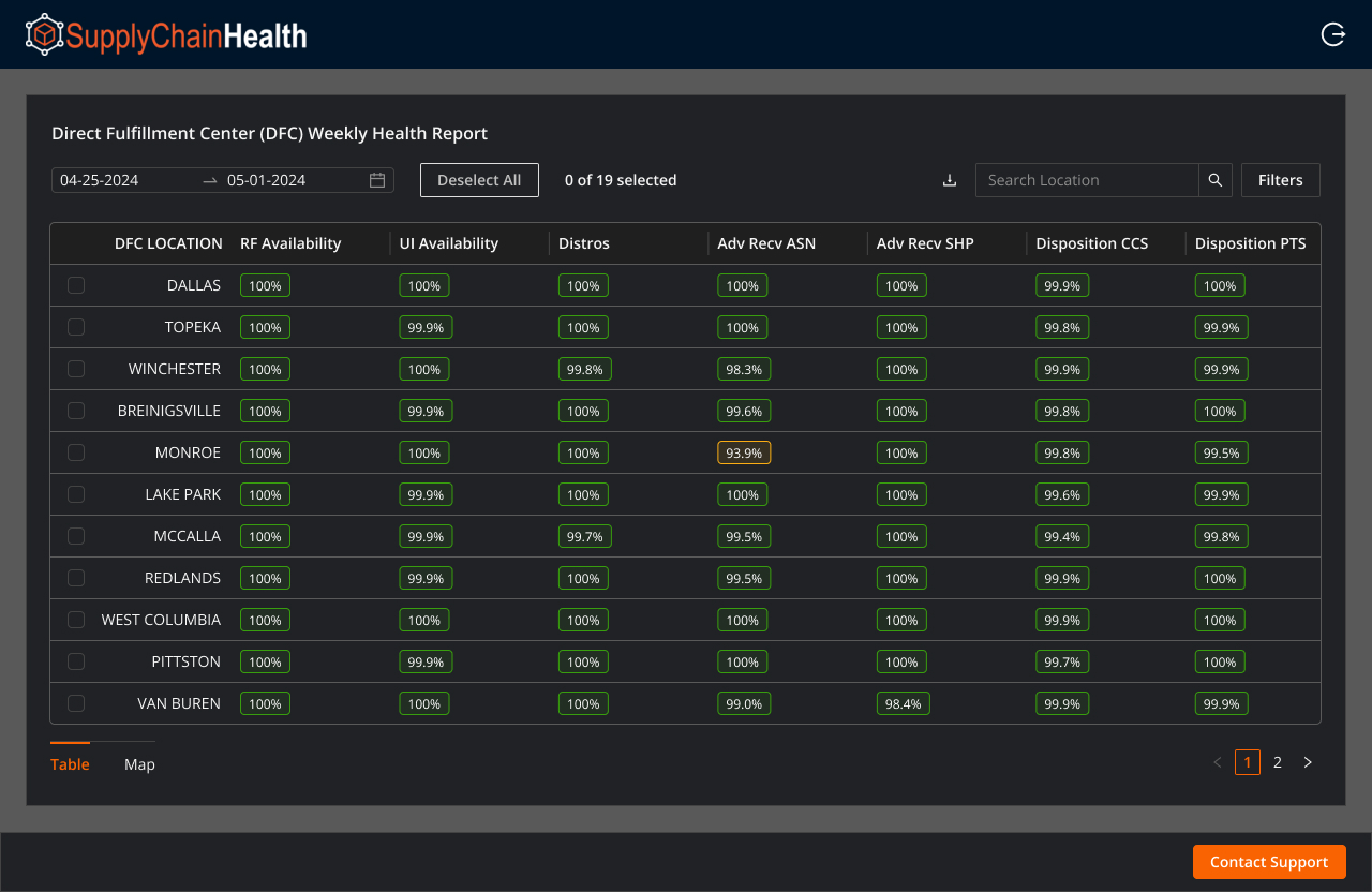
2. DATA METRICS REGARDING THE SUPPLY CHAIN HEALTH OF CENTERS
Through the table feature accessible for all eight centers and facilities, users can see the 15 different health metrics tracked for the supply chain process. The table includes pagination to go through all 19 locations, and users can scroll through the table to see each metric, highlighted either green, yellow, or red based on the value.
Through the table feature accessible for all eight centers and facilities, users can see the 15 different health metrics tracked for the supply chain process. The table includes pagination to go through all 19 locations, and users can scroll through the table to see each metric, highlighted either green, yellow, or red based on the value.
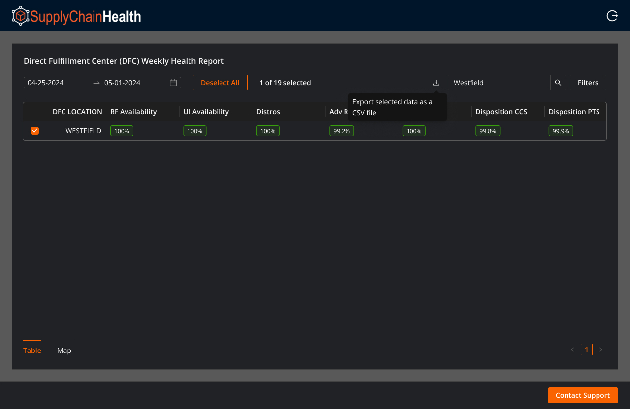
3. ACCESS TO EXPORT SELECTED DATA AS A CSV FILE
Users can use the table to download data as a CSV file to reference a location’s supply chain health. Users can export the entire table’s featured data by selecting all locations or only specific locations. The feature’s purpose is to limit management and organizational issues for upper leadership.
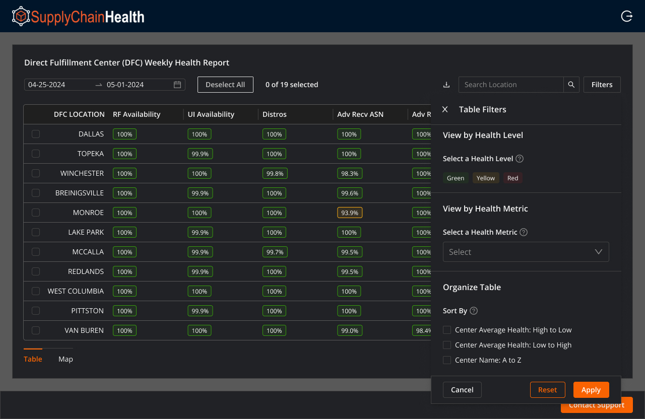
4. FILTER FEATURE TO COMPREHEND THE DATA BETTER
To understand the data displayed, users can filter the table feature to see what they desire. Users can search for a location, view metrics based on their health level (green, yellow, red), view a specific metric, sort the table based on average health, or organize the table A-Z based on the center name.
To understand the data displayed, users can filter the table feature to see what they desire. Users can search for a location, view metrics based on their health level (green, yellow, red), view a specific metric, sort the table based on average health, or organize the table A-Z based on the center name.

5. MAP SHOWCASING AVERAGE HEALTH AND LOWEST METRIC
The map feature is easily accessible through the landing page or by simply switching over from the bottom left navigation on the map or table pages. The map showcases the average health of a location, along with its lowest health metric. Users can also apply filters to the map to see specific locations or view additional geographical elements.
The map feature is easily accessible through the landing page or by simply switching over from the bottom left navigation on the map or table pages. The map showcases the average health of a location, along with its lowest health metric. Users can also apply filters to the map to see specific locations or view additional geographical elements.
⎯⎯⎯⎯⎯⎯⎯⎯⎯⎯⎯⎯⎯⎯⎯⎯⎯⎯⎯⎯⎯⎯⎯
WORKING PROTOTYPE
TOUCH ANYWHERE ON THE SCREEN TO SEE HINTS THAT DIRECT YOU TO WHERE TO CLICK TO PROCEED WITH THE FIGMA APP FEATURES. USE ON DESKTOP FOR OPTIMAL EXPERIENCE.
The prototype showcases logging into the landing page and the two main functions of the app: the table and map. Horizontally scroll through the table to analyze the displayed data or get a general overview of the supply chain health through the map page.
⎯⎯⎯⎯⎯⎯⎯⎯⎯⎯⎯⎯⎯⎯⎯⎯⎯⎯⎯⎯⎯⎯⎯
CLOSING
UNDERSTANDING THE SUPPLY CHAIN PROCESS AND PAINT POINTS OF HOME DEPOT EMPLOYEES ALLOWED ME TO SUCCESSFULLY CREATE AN ACCESSIBLE TOOL ALONGSIDE ENGINEERS AND PRODUCT MANAGERS.
Although my approach to this summer-long project was successful, one aspect I could have improved was my communication with developers throughout the UX process. My prototype and screens were implementable for the supply chain developers on my team, but the end product saw a few minor differences from the Home Depot design system. Communicating more consistently with engineers is one of the biggest takeaways from my internship and something I plan on improving in the future.
Altogether, I gained hands-on experience with the entire UX process for a product launch, from start to finish. The opportunity to work through research synthesis, solution ideation, prototyping, and finally shipping my designs to developers to build out was insightful and exciting. While developing my UX skills, I was also able to expand my collaborative mindset and hear helpful feedback from stakeholders when presenting my finalized project. I’m grateful to have worked at The Home Depot, and I want to especially thank my manager, Rachel Minnicks, and mentor, Felipe Solis, for providing me with the resources to succeed and grow.